
ReportMap Release 1.2
Version 1.2 of the ReportMap Google Map plugin has been released today. While the rest of you have been idling away under Covid-19 restrictions, I’ve been happy as a clam working on some exciting enhancements to the plugin.
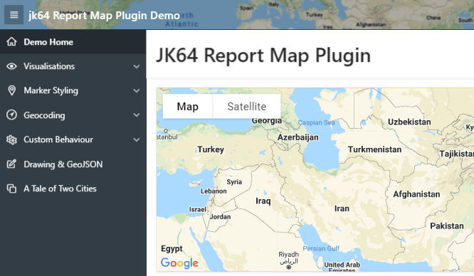
If you just want to get in and have a play, check out the demo on apex.oracle.com.
New Features in this Release
Included in this release are the following new features:
- New visualisation: Spidifier
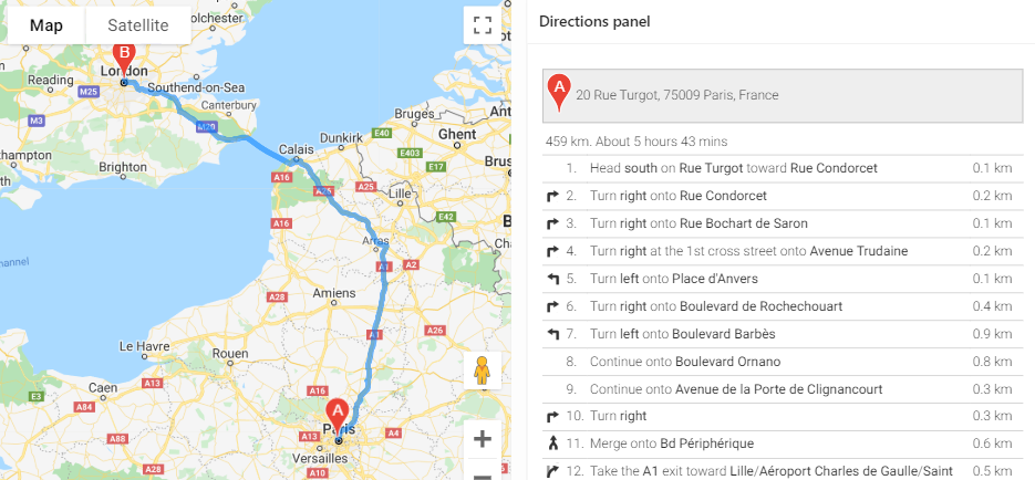
- Show turn-by-turn Directions
- Customise each Marker with your own JavaScript function
- Load large data sets in batches
- Show spinner while data is loading
- Localisation options
A bug when the new Friendly URLs feature of Oracle APEX 20.1 is used with the Clustering visualisation has also been fixed in this release.
The full list of enhancements and bugfixes, with links to the issues register, may be viewed here.
The documentation has been updated. The plugin now has four new plugin attributes, as well as a number of other attributes that can be set via JavaScript (the officially supported ones are documented on the plugin attributes page). Three new plugin events have also been added to support the new features.
Spiderfier
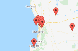
If you have a map that needs to show a lot of pins, especially ones that are close together, the plugin previously had the option of Clustering them at high zoom levels. The user could click on a cluster to zoom in enough to show the individual pins. One weakness of this approach is that if one or more pins are almost (or exactly) overlapping, the cluster never “unclusters” – the user cannot zoom in far enough to get the pins to show individually.
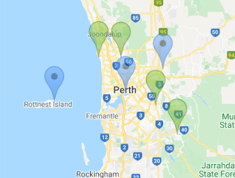
This release provides another Visualisation option, Spiderfier. This uses the OverlappingMarkerSpiderfier to control how pins react when clicked. When the user clicks a pin that is close or overlapping with other pins, it shifts the pins in that area into a ring, or a spiral (depending on how many pins are there) with lines pointing back to their original location. It also colours them blue to indicate they’ve been “spiderfied”. The user can then hover and click each marker separately.
If the user zooms in, the Spiderfier automatically returns all the pins to their original location.
I think the defaults I’ve set work reasonably well. If needed, you can customise the Spiderfier by setting its options via the JavaScript Initialisation Code (refer to “spiderfier options” here for details). You can also provide your own formatting function to change how the markers look when they are “spiderfied”.
Marker Icons
The WIKI has been augmented with a handy guide to Map Icons. The plugin has long supported the ability to specify custom images for the marker icons. This release gives a whole lot more control over the markers to the developer:
If all the icons in the query are being loaded from the same location, you can now set the iconBasePath option once and just have a relative icon file name in the query. When there is a lot of data to show in the map, this can significantly reduce the volume of data loaded to the client, which can lead to a significant performance improvement.
The developer can now supply a custom JavaScript function (via the markerFormatFn option) to format each marker using whatever logic they need.
For example, if the marker icon needs to be different according to some data value, you can send the data via one of the flex fields, and then write your custom function to set the marker icon depending on the value of the flex field.
You could also modify other characteristics of the marker, such as the title (hover text), info text (popup window), icon anchor point, opacity, and even position (although usually I’d expect your query would provide the correct lat/lng coordinates).
If you have a large number of custom icons you wish to use, along with a large data set of pins to render on the map, you could even compile the icons into a single sprite map to reduce network overhead. This means the image file is loaded once to the client, and then the map “cuts out” bits of the sprite map to render the marker icons. This can be done by setting just a few attributes of the marker’s Icon object. I haven’t tried it myself yet, but this tool looks like it would be useful for this purpose.
Loading Large Datasets
This release adds the Show Spinner and the Rows Per Batch attributes. These attributes are independent of each other, and they help to improve the quality of the experience for your end users when you are rendering a large number of pins on the map.
By default, new maps will have Show Spinner set on. For any existing maps, after upgrading you can turn this option on by setting it in the plugin attributes. This option causes the map to show the default APEX spinner while the data is loaded. The spinner is then removed when the last marker has been rendered. The effect is to give the user an indication that the map is “working”, and gives them immediate feedback when the data has finished loading and they may now interact with the map.
If the spinner seems to stay forever, it may indicate an issue with connectivity to the server (or perhaps that the server is under severe load or has stopped responding to requests).
When the APEX page has been rendered on the client, the Google Map is shown but the data is not immediately loaded; instead, a separate AJAX request is sent to the server to run your query and download all the data to render the pins on the map. By default, this is all done in one single AJAX call, which is the fastest way to get from start to finish; the downside is that the user will not see any pins on the map until all the data has been downloaded. You can change this behaviour by setting Rows Per Batch to some number (e.g. 1000). With this attribute set, the plugin will send a series of AJAX calls to the database (one at a time) and get a batch of records at a time. After loading a batch, the plugin will render the pins on the map (and if necessary, it will pan / zoom the map to show them all) and then send another AJAX request to get the next batch. When it has finished receiving all the batches, it adds any finishing touches needed (e.g. for a visualisation) and returns control to the user.

The advantage of this approach is that the user can see the pins being shown gradually, and they will know that “something is working”. This may help to give them a nicer user experience.
The downside of this approach is that it may cause a bigger load on the server (because each AJAX request requires running a new query, with an offset) and will usually take longer from start to finish. Generally, if your data comprises only a few hundred records at most, you will probably want to leave the Rows Per Batch setting blank.
The Future
There are still a few little enhancements on my “todo” list, but I’m keen to hear how you are using (or perhaps planning to use) this plugin, and if there are any new features or improvements that you need or want. If so, please raise them on the GitHub Issues page.
Quite a few people have raised questions or ideas in the past and sometimes I’ve incorporated them straight away, and other times it’s taken a little longer but I get there eventually. If you’re keen to contribute, feel free to have a poke around in the code and perhaps even do a pull request on the GitHub source to suggest a change. It would be great to collaborate with you because everyone has something unique to offer.
Long-term, I’m watching with interest the future direction of Oracle APEX. I remember at one point they were talking about incorporating some sort of new map region into the product, although the mention of this seems to have been dropped from the Statement of Direction (or maybe my memory is misleading me). I guess time will tell.